Modern Bank UI.
A frontend-only banking landing-page concept built with React, Vite, and Tailwind CSS, focused on modern fintech visuals, responsive layout, and reusable component structure.
UI Concept · 2024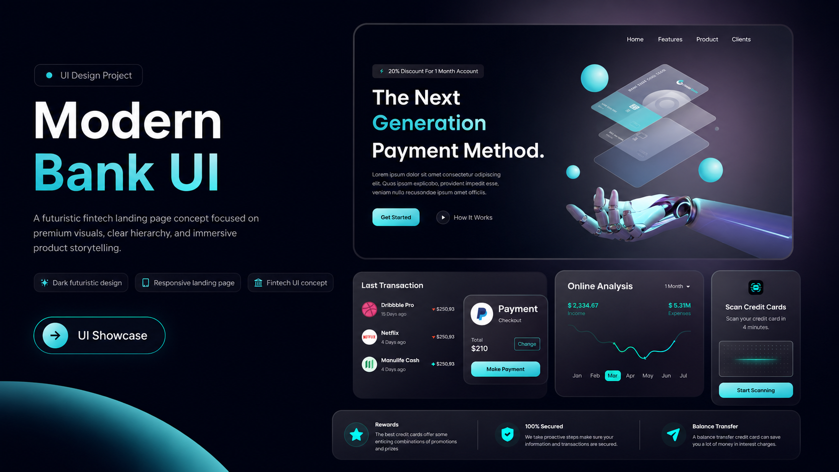
- 01 · Role
- Frontend implementation · Responsive UI development
- 02 · Platform
- Responsive Web
- 03 · Period
- 2024
- 04 · Status
- UI Concept · 2024
Project context
Modern Bank UI is a frontend UI study created to present the visual language of a modern digital banking and fintech product. It is not a real banking system or a full-stack application; the project focuses on landing-page hierarchy, responsive behavior, visual consistency, and reusable React components. The page combines navigation, a hero section, statistics, feature cards, product presentation blocks, testimonials, partner logos, a call-to-action, and a footer into one cohesive marketing experience.
Core challenge
The main challenge was translating a visually rich fintech interface into a layout that remains balanced across different screen sizes while avoiding a monolithic JSX structure. Large typography, product mockups, gradient effects, feature cards, and two-column sections all needed to reflow naturally for smaller devices without losing the original visual hierarchy.
What I built
- 01
Built the component-based frontend structure with React and Vite.
- 02
Separated the interface into reusable Navbar, Hero, Stats, Business, Billing, Card Deal, Testimonials, Clients, CTA, and Footer components.
- 03
Implemented responsive section layouts and spacing behavior with Tailwind CSS breakpoints for desktop and mobile screens.
- 04
Created visual details including gradient text, blue and pink background glows, hover states, card shadows, and the animated mobile navigation menu through custom CSS utilities.
- 05
Centralized shared heading, paragraph, spacing, width, and section-layout utilities to keep the interface consistent and reusable.
- 06
Rendered repeated UI content such as navigation links, features, statistics, testimonials, partner logos, and social links from structured constants.
- 07
Published the project on Netlify so the responsive implementation can be explored through a live demo.
Technical approach
The application runs on React 18 with Vite and uses Tailwind CSS for its styling layer. The main App component composes the page from independent Navbar, Hero, Stats, Business, Billing, CardDeal, Testimonials, Clients, CTA, and Footer sections. Shared layout values are centralized in style.js for maximum content width, spacing, typography, and section direction. Responsive behavior is handled through Tailwind breakpoints that switch key sections between row and column layouts. The visual system uses custom radial and linear gradients, hover states, blurred background effects, and lightweight animation rules defined in index.css. Navigation, feature data, statistics, testimonials, partner logos, and social links are stored in shared constants and rendered into reusable UI components. The project is intentionally frontend-only: it does not include authentication, account management, real payment processing, APIs, or a backend data layer.
System structure
- 01
Framework
React · Vite - 02
Styling
Tailwind CSS · Custom CSS - 03
Structure
Reusable React Components - 04
Responsive
Mobile · Tablet · Desktop - 05
Deployment
Netlify
Current state
The project is complete and publicly available as a live frontend UI concept on Netlify. The landing page and responsive interactions are functional, while the product intentionally remains presentation-only and does not implement real banking operations, user accounts, authentication, transactions, or backend services.